STOA
AI-guided anxiety intervention, exactly when you need it.
Solo Designer
Winter 2026
Figma
Elicit
Claude Opus 4.6
Figma Console MCP
Smartphone
Smartwatch
The AI-powered wearable that intercepts acute anxiety
Proprietary smart band detects elevated physiological stress before panic peaks
App immediately delivers an anchoring exercise grounded in cognitive behavioral therapy (CBT): breathing, grounding, or a Stoic reframe
Pattern learning personalizes detection thresholds over time
- •
Intervene before cognitive function is fully impaired
- •
Complete an anchoring technique in less than 2 minutes, in a public setting
- •
Zero false-alarm fatigue: detection precise enough that every alert means something
Panic attacks don’t wait for you to ask for help
Anxiety disrupts the ability to think clearly and act, yet existing tools wait for the user to open an app and start an exercise at exactly the moment they are least able to. Most people never do; avoidance is the most common response.
I designed STOA to make the first move
STOA reads the body’s stress signals and starts an intervention on its own, cognitive, behavioral, or body-based, matched to the moment, closing the gap between needing help and being able to seek it.
Introducing STOA.
A quick walkthrough of the AI anxiety intervention: the smart band detection, the anchor flow, and the Stoic voice that carries it.
Solo Designer
Solo, so I owned all of it:
- •
The literature synthesis, 42+ sources across six research questions
- •
The empathy map and both Jobs-to-be-Done frames
- •
The design system: 109 tokens, eight type styles, four brand colors
- •
Every screen, on the phone and on the watch
- •
The Wizard-of-Oz band and the session it ran
- •
The AI workflow: the brief, the generated screens, the critique
- •
Just me, with Claude as an AI design partner
- •
6 weeks from research to prototype
The evidence says the system has to make the first move
Mixed methods from discovery through delivery: a literature synthesis of 42+ academic sources across six research questions using Elicit, lived-experience accounts from people who have had panic attacks, a behavioral empathy map and two Jobs-to-be-Done frames, then a Wizard-of-Oz test and a structured critique of the built screens. Four findings came back, and not one of them left room for a product that waits to be opened.
“Even in the midst of the darkest panic attack, part of you is still rational. The rational part is paralyzed, a helpless spectator to your madness.”
Anxiety sensitivity is the real problem.
People fear the sensations of anxiety, the racing heart, the tight chest, more than whatever causes them.
Random delivery makes things worse.
Interventions triggered by personal physiological thresholds significantly outperform scheduled reminders or random notifications.
Wearables work.
Consumer smartwatches show strong accuracy for anxiety detection. Personalized machine-learning models outperform generic approaches after a 1–2 week learning period.
CBT is the framework. Stoicism is the voice.
Modern CBT descends directly from Stoic practice, so the Stoic voice is functional, not decorative: it's the original source of the cognitive techniques the app delivers. The evidence supports cognitive reframing alongside behavioral and somatic techniques, so STOA draws on all three, with Stoicism setting the tone.
How might we deliver evidence-based interventions through a wearable, precisely at moments of high anxiety?
From a literature review to a band that lights up
Research left one challenge to build against: deliver an evidence-based intervention through a wearable, at the moment anxiety peaks. Answering it took three moves.
Describe the user by behavior, not biography
A panic episode is a behavior pattern, not a demographic, so the empathy map records what someone says, thinks, does and feels during an episode rather than who they are. The pains and gains are written as patterns, loss of agency, privacy and dignity, return to baseline, so they hold for anyone having this experience.
Two jobs came out of it. The primary one is what the product is built to do. The secondary one turned out to matter almost as much: people cannot always tell a panic attack from a heart attack, and the fear of getting that wrong is its own source of panic.
Write the rules once, then hold every screen to them
Working solo with an agent, the bottleneck is not producing screens, it is keeping fifty of them consistent. So the visual and interaction rules went into a single CLAUDE.md brief before any screen was generated, and every screen was checked against it afterward.
Literature synthesis: 42+ sources across six research questions, using Elicit
Define: the empathy map and the two Jobs-to-be-Done above
CLAUDE.md design brief: the visual and interaction rules, written once
Design system: tokens built to WCAG AA contrast through Figma Console MCP
Storyboard and screens: 10 storyboard panels, then the UI in Figma with Claude Code
Wizard-of-Oz and critique: a physical band tested live, the screens read by a skeptic
Where AI did the producing, the direction stayed mine: Elicit synthesized the literature and I verified every finding before using it; an image model drew the storyboard panels from descriptions I wrote; Claude Code built screens against the brief. The palette, the type, the layout and the interaction patterns came from the research.
Build it rough, then invite people to break it
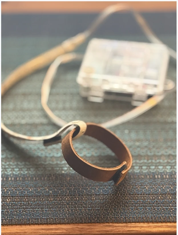
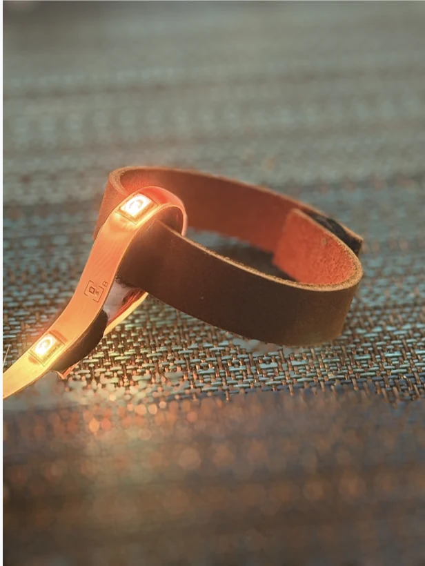
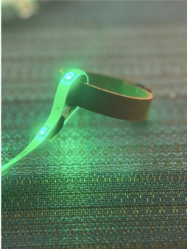
The detection half of this product cannot be tested on a screen, so it was tested on a wrist. I built a band with an LED and drove it by hand while someone wore it: amber when I decided their stress had spiked, green once the exercise brought them back. A Wizard-of-Oz rig, where the intelligence is a person hiding behind the curtain.
Then I put the work in front of a critic and asked an agent to attack it. Five things came back, and each one changed something:
- SourceThe critiqueWhat changed
- Design crit
The problem statement was too solution-specific, locking the work into Stoic interventions before any divergent exploration could happen.
Rewrote it as the challenge that now closes Research, dropping three assumptions: that every intervention is Stoic, that cognitive reframing is always the mechanism, and that users already have coping strategies.
- Design crit
The empathy map read like a persona. Pains and gains named exact time windows and treated colleagues as the only audience for disclosure.
Rewrote both as behavioral patterns, managing episodes with privacy and dignity, regaining control more quickly, so they describe the episode rather than one person.
- Design crit
Stoicism was carrying more weight than the evidence supports.
CBT became the framework and Stoicism became the voice. The techniques are the clinically grounded ones; the tone is what makes them land.
- Agent critique
“I feel calmer” implies a binary success state, with no path for someone who feels worse.
The check-in now offers five honest options including “still anxious.” Where that path leads is still unbuilt, and it is the first thing in the backlog.
- Agent critique
Onboarding shows a live heart-rate dashboard without ever asking to read the wearer’s body.
Named as a gap rather than patched. A product that reads your body has to ask first, and the consent flow is the second thing in the backlog.
The design system built for a cognitive crisis
Every choice ran through one filter: is this usable by someone having an acute anxiety attack, in public, with shaking hands? The answer was to strip the interface to almost nothing, and to make every value in it checkable.
Ten colors, and not one of them is red
Red means danger, and a product that tells an anxious person something is wrong has already made things worse. The palette is built the other way: Aegean Deep to settle, Bronze for the single action worth taking. The four names, Aegean Deep, Bronze, Obsidian and Marble White, trace to the ancient Mediterranean, where Stoicism started.
- Aegean Deep#184C5Acalm · surfaces · outlines
- Bronze#A67C52the one action on the screen
- Obsidian#0F2E38headings on light
- Marble White#F7FAFBthe ground everything sits on
- Calm Blue#5A8E8Esecondary accents
- Bronze Light#D4A574rings · detection state
- Aegean Tint#E8F1F3cards on the gradient
- Pewter#5A7A82body · secondary text
- Light Stone#C7D4D8borders · unselected
- White#FFFFFFcards · sheets
Every pair checked against the color it describes
Each ratio below is computed from the same hex the swatches render, so a contrast claim cannot drift from the color it is about. Bronze is the honest one: it clears AA only at 17px and above, so it fills buttons and never carries body text.
- White on Aegean Deep9.46:1 · passes WCAG AA
- White on Obsidian14.30:1 · passes WCAG AA
- Obsidian on Marble White13.64:1 · passes WCAG AA
- Pewter on Marble White4.41:1 · below WCAG AA
- White on Bronze3.73:1 · passes WCAG AA at 17px and above
Two faces, eight styles, one job each
Plus Jakarta Sans does the work of the interface. Cormorant Garamond appears only when a Stoic passage does, so the change of voice is visible before the words are read.
- Calm in any stormDisplay · 32px · one per screen
- Calm in any stormTitle · 22px · section heads
- Calm in any stormAction · 17px · buttons · the AA Large floor
- Calm in any stormBody · 16px · instructions
- Calm in any stormBody Small · 15px · supporting copy
- Calm in any stormCaption · 14px · metadata
- Calm in any stormMicro · 11px · tab labels only
- Calm in any stormReflection · 28px · the Stoic voice
Sized for hands that are shaking
Everything a user touches mid-episode is bigger than the guideline requires, on a four-step spacing scale with nothing in between, so there is never a decision about which gap to use.
- xs · 4px
- sm · 8px
- md · 16px
- lg · 24px
Key Screens
The first screen says what the product does and asks for nothing. Someone deciding whether to let an app read their heart rate should know its job before it starts reading.
Onboarding asks which approach helps you find calm, so the first intervention is one the user already believes in rather than one the model guessed at.
One vital sign, one streak, one last session. A stressed user needs reassurance at a glance, so the dashboard holds everything else back.
The bet the whole product rests on: detect an acute anxiety attack as it begins and reach out first, because no one opens a wellness app mid-panic.
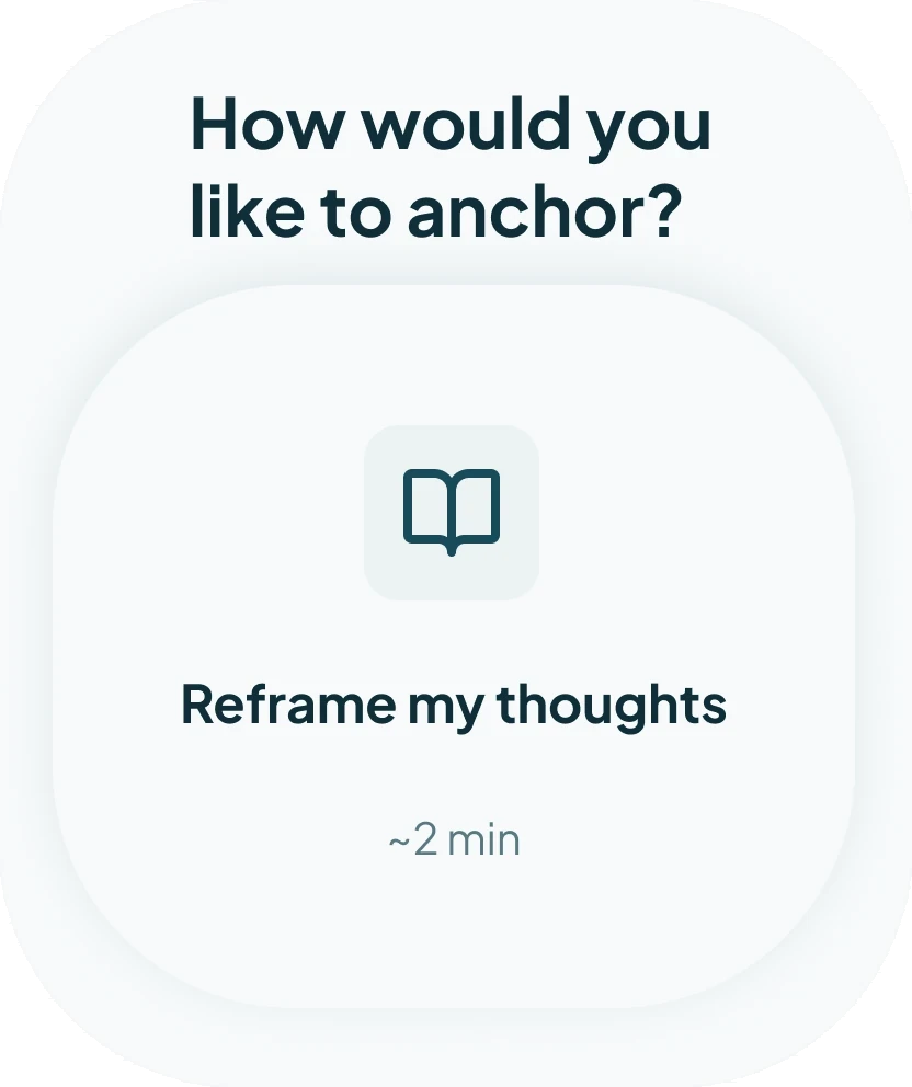
Two ways in: calm my body, or reframe my thoughts. The user picks the modality, or hands the choice to STOA, because agency is the thing an anxiety episode takes away.
The wait is shown rather than hidden. A recommendation that appears instantly reads as a guess, and a user mid-panic has no patience for a guess.
The AI explains each recommendation, what it detected and why this technique fits, because an anxious user won’t act on advice they don’t understand.
The words of Stoic philosophers instead of a clinical script. The prompt copy was written as deliberately as the layout was designed, because the message those words carry is what helps someone calm down.
Five honest options, including “still anxious,” so the product records what actually happened instead of assuming success.
Episodes and recovery time, week by week, the numbers that show whether the product is actually helping.
On the wrist, where the detection happens
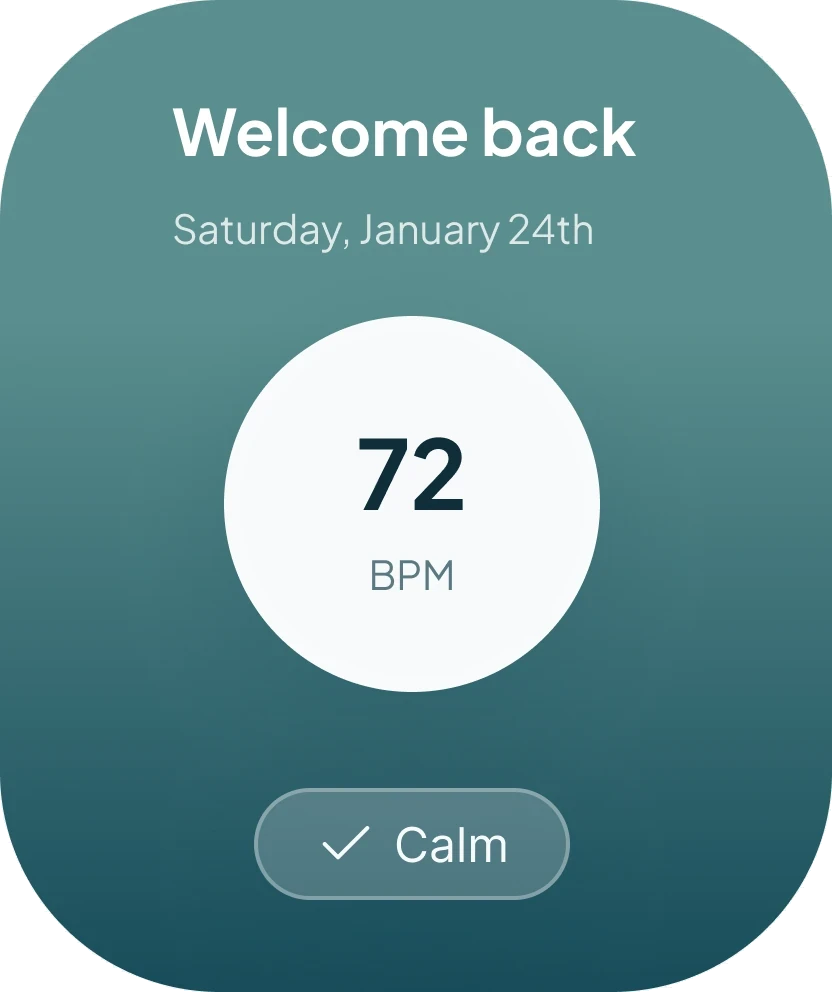
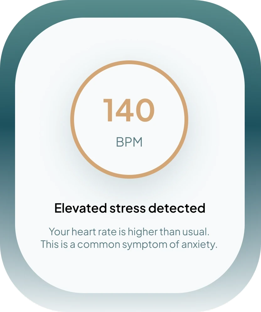
STOA notices before the wearer does, so the first thing anyone sees is on their wrist rather than in their hand. Three states carry it: a resting baseline, the reading that crosses the line, and the anchor offered straight away, all reachable without taking a phone out in a room full of people.
The audit: what I’d fix next
- 01Darken Pewter until it clears AA
Pewter is the token for body and secondary text, and on Marble White it measures 4.41:1, just under the 4.5:1 that AA requires. On pure white it reaches 4.62:1 and passes, which is how it survived review. Darkening it to #57757D puts it at 4.72:1 on both grounds, a shift small enough that nothing else in the system has to move.
- 02Stop treating Calm Blue as a text color
Calm Blue measures 3.52:1 on Marble White. That clears AA for large text only, so it works as an accent, an icon fill, and a chart color, and should never be asked to carry a sentence. The style guide currently lists it next to Pewter as body and secondary.
- 03Keep one card radius, not two
Cards are specified at 24px in one place and 16px in another, under names close enough to be mistaken for each other. Pick one radius for cards and give the sheet its own name, and the rule becomes something another designer can follow without asking which card this is.
- 04Retire the superseded type sheet
The Figma file still holds an earlier typography sheet set in Georgia alongside the current one set in Cormorant Garamond. Both are reachable, neither is marked, so the first thing a new person opens is a coin flip. Delete the old one.
The whole flow, from first reading to recovery
A live, clickable Figma prototype: the band detecting a spike, the choice of anchor, the Stoic passage that carries the exercise, and the check-in afterward. Move through it the way someone mid-episode would.
What designing for a crisis taught me about AI
The design brief did more work than the AI model.
The CLAUDE.md design brief encoded the visual and interaction rules once, and every generated screen was held to it. Generating with AI is the easy part; the judgment is the work: deciding what’s true, what to cut, where the line sits. A sharp brief produces sharp output. A vague one produces confident nonsense.
An AI that can’t show its reasoning can’t be trusted, least of all mid-panic.
Designing the recommendation screen, the question was never which intervention the AI should pick, it was whether an anxious person would believe it. So every recommendation shows its evidence, the readings that triggered it and why this technique fits. Advice that arrives without a reason is easy to dismiss, and someone mid-panic will dismiss it.
A high-fidelity screen makes promises the copy never wrote.
I asked Claude to describe the product from the screens alone, with no copy deck. The description that came back had STOA walking you through a breathing or journaling exercise. Journaling existed nowhere in the product: a book icon and a quote screen had implied a writing feature on their own. A misread icon sets an expectation before a single word is read.
AI is good at noticing. It’s bad at caring.
The watch detects the spike; the model proposes the intervention. But what actually calms someone, a Stoic voice instead of a clinical alert, the right tone at 140 BPM, came from research and empathy, not the model.
AI turned the job from making into directing.
Across research, copy, and the build itself, AI kept the raw material coming, and my job was choosing between it all: what to keep, what was off, what to cut. The moment I stopped steering, quality fell off.
What I’d do differently
Resolve the “Still anxious” path first.
I’d prototype the failure state before the success state, which carries the highest emotional stakes in a mental health product, and I left it unanswered.
Add consent before biometrics.
Onboarding jumps from anchor selection straight to a live BPM dashboard without explaining how physiological data is collected, stored, or used. A product that reads your body has to ask permission before it starts listening.
Test the error states.
The wearable band disconnecting mid-exercise. A failed session. A false detection. Each one lands on a user who is already on edge, and the prototype never answered them.