CEO XB
An AI-assisted peer-accountability platform built and delivered for European life-sciences CEOs entering the US market.
Prototyping & Technology Lead
Spring + Summer 2026
~20 weeks
4 designers + CEO XB co-founders
Figma + Figma MCP
Claude Code
React / Tailwind
Vercel + Anthropic API
Optimal Workshop
Maze
The cohort platform that turns a monthly business update into a conversation with a peer who can help
A confidential cohort of 10 to 12 CEOs entering the US market is the app’s home screen
A monthly business update with AI drafting: what moved forward, what is next, where a member needs help
Coffee chat scheduling on every surface, so any member can book time with a peer
An event calendar for cohort sessions and industry conferences, showing which peers are already going
- •
A new member finishes onboarding and books their first coffee chat with no help
- •
Logging a monthly business update feels like a five-minute win, not a chore
- •
The client ends the project knowing what keeps a CEO coming back to the platform, proven in a working product
- •
Launch is measured on monthly active members, coffee chats scheduled, and business updates posted
Breaking into the US market with no roadmap, no local network, and no one who understands the pressure is lonely
CEO XB was built for exactly that: a confidential cohort of 10 to 12 European life-sciences CEOs entering the US together, holding each other accountable. But the cohorts only meet remotely, a month apart, and that month was the part nobody had solved yet: what brings a CEO with no spare hours back to the platform between those meetings?
I helped build the app around the cohort, so connections, networking, and accountability are one tap away
A member drafts a monthly business update for their cohort, with AI on hand to start it from last month’s or improve what they wrote. The update posts to a shared cohort feed, making progress and problems visible to the group, and any member can book a coffee chat straight from it.
Visibility is the mechanism, not the point. Every feature was measured against one test: does it end with two people talking?
- Without CEO XB
You have to work out what comes first: regulatory approval, reimbursement, hiring, or raising money in the US
With CEO XBYour cohort has already worked through the same regulatory, reimbursement, and hiring questions
Nobody at your company has taken a product into the US, and your network is back in Europe
10 to 12 CEOs are taking their own products into the US right now, and some are ahead of you
You say what you will tackle next quarter, and nobody follows up on whether you did or not
You post a monthly business update, and the whole cohort sees what you committed to
When you get stuck, nobody around you has been stuck on the same thing
A peer who has made the same call books a coffee chat and tells you how it went
Introducing CEO XB.
A walkthrough of the live product. Julie has her second cohort meeting coming up, so she drafts her monthly business update, reads what her peers moved on since last month, and books a coffee chat with the one facing the same problem she is.
Prototyping & Technology Lead
I owned:
- •
The coded build, in React and Tailwind, and every technical stack decision
- •
The Vercel deployment pipeline
- •
AI feature design and the Anthropic API integration
- •
Design system reconciliation, Figma to code
- •
Figma MCP automation
I helped with:
- •
The moderated usability study
- •
Laura Cochran, Product Design Lead
- •
Somya Bhatia, Client Liaison
- •
Emily Yang, Product Designer
- •
Me, Prototyping and Technology Lead
- •
The CEO XB co-founders, our clients
- •
Spring 2026: concept testing and definition
- •
Summer 2026: the coded build, a moderated usability study, and the final handoff
What brings a CEO back is the other CEOs
Six rapid prototypes, each with its own research instrument, tested two bets about what pulls a member back between sessions: accountability and networking, three prototypes each. The wider study ran from discovery through delivery: stakeholder interviews with the co-founders, a literature review on what sustains peer communities, a generative concept test in Optimal Workshop, and an evaluative, task-based usability study in Maze.
Two carried into the product. Warm Welcome became the coffee chat that onboarding now ends on, and The Streak became the monthly business update.
Accountability
The bet: CEOs come back to the platform because it helps them follow through on what they said they would do.
Networking
The bet: CEOs come back to the platform because it makes their peers visible and easy to reach between sessions.
The networking bet carried the direction, and The Streak crossed over from the other one, slowed from weekly to monthly at the client’s request. The remaining four told us what not to build.
Human facilitation is part of the product, not a gap in it
A stakeholder crit corrected where the concepts were heading. CEO XB is run by two founders who select each cohort, make the introductions, and hold the room, and our early passes had quietly designed that job out, treating the app as the thing that connects people.
So we sorted the program by what a screen can actually carry. The platform owns the month between sessions: visible updates, scheduling, the event calendar. The founders get somewhere to point rather than a job taken off them. What it leaves alone is the facilitation itself, the matching and the sessions, which is the part members joined for.
From a design challenge to a live build
Concept testing left one challenge to build against: make business moves visible in a way that feels natural and leads to a coffee chat. Answering it took three moves:
Merge two products into one structure
I designed the stakeholder workshop that put our surviving concepts next to the 2025 build and forced a call on every feature: kept, demoted, or retired, so nothing disappeared silently. The client’s number-one ask was that the cohort page become the home screen.
- 2025, built around the course
Home: your progress through the eight-module course
2026, built around the cohortMy Cohort: your peers, the facilitator, and the next session
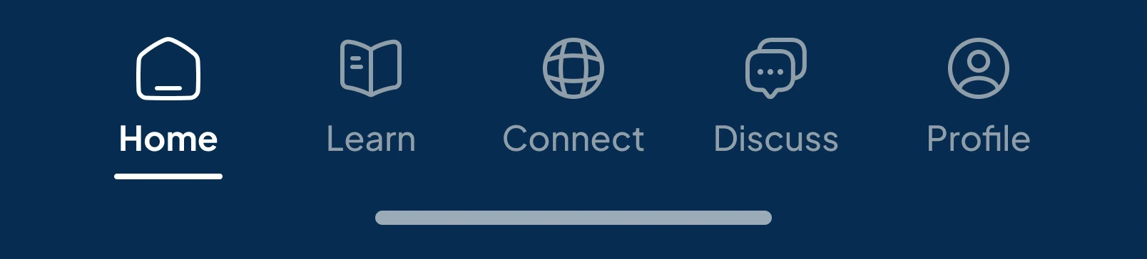
Learn: the course itself, and the spine the whole app hung on
Education: the same modules, now optional and off to one side
Connect: a directory of profiles with nothing happening in them
Members: everyone on the platform, with your own cohort listed first
Discuss: threads filed under whichever course module they came from
Cohort feed: this month’s updates from the people you answer to
Profile: a photo, a bio, and your course certificates
Profile: company, stage, funding, and the moves you have logged
Narrow to one journey, then build it
We had inherited a working five-tab app from 2025 and were adding a cohort feed, a monthly update flow, and coffee chat scheduling on top of it. All of it would not fit in one quarter, so we took a single path end to end instead of every path partway: onboarding into a cohort, the monthly business update, and the coffee chat it leads to. The home screen alone took three passes.
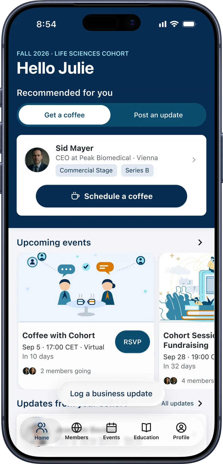
The 2025 home screen opened on a course module. Our first pass moved the cohort to the front but gave it three cards competing for the same attention. The shipped version keeps one recommendation: a named peer, the company and stage that make them worth meeting, and a single button to book a coffee chat. Events move below the fold.
Put it in front of people, then fix what they found
With the journey built and deployed, we put it in front of people in a moderated study through Maze, framed around the client’s own test of a good update: “easy, intuitive, not a chore.” Four things came back:
“Honestly, that doesn’t feel like a button. It just feels like user info.”
An affordance failure, fixed at the component level.
“There’s too many things that all need my attention. What do I do first?”
The hierarchy worked; it was pointing at the wrong thing.
“Some read it as physically relocating the company.”
The study’s lowest ease-of-use rating traced to a word, not a workflow.
“I expected draft for me to gather data from across my account.”
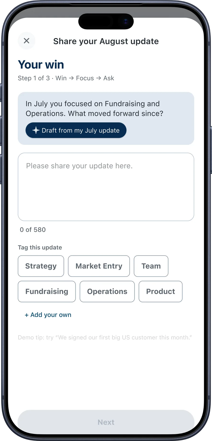
The AI moved from ghostwriter to editor, and learned to read their history.
Two changes, before and after
Drag the divider on either screen.
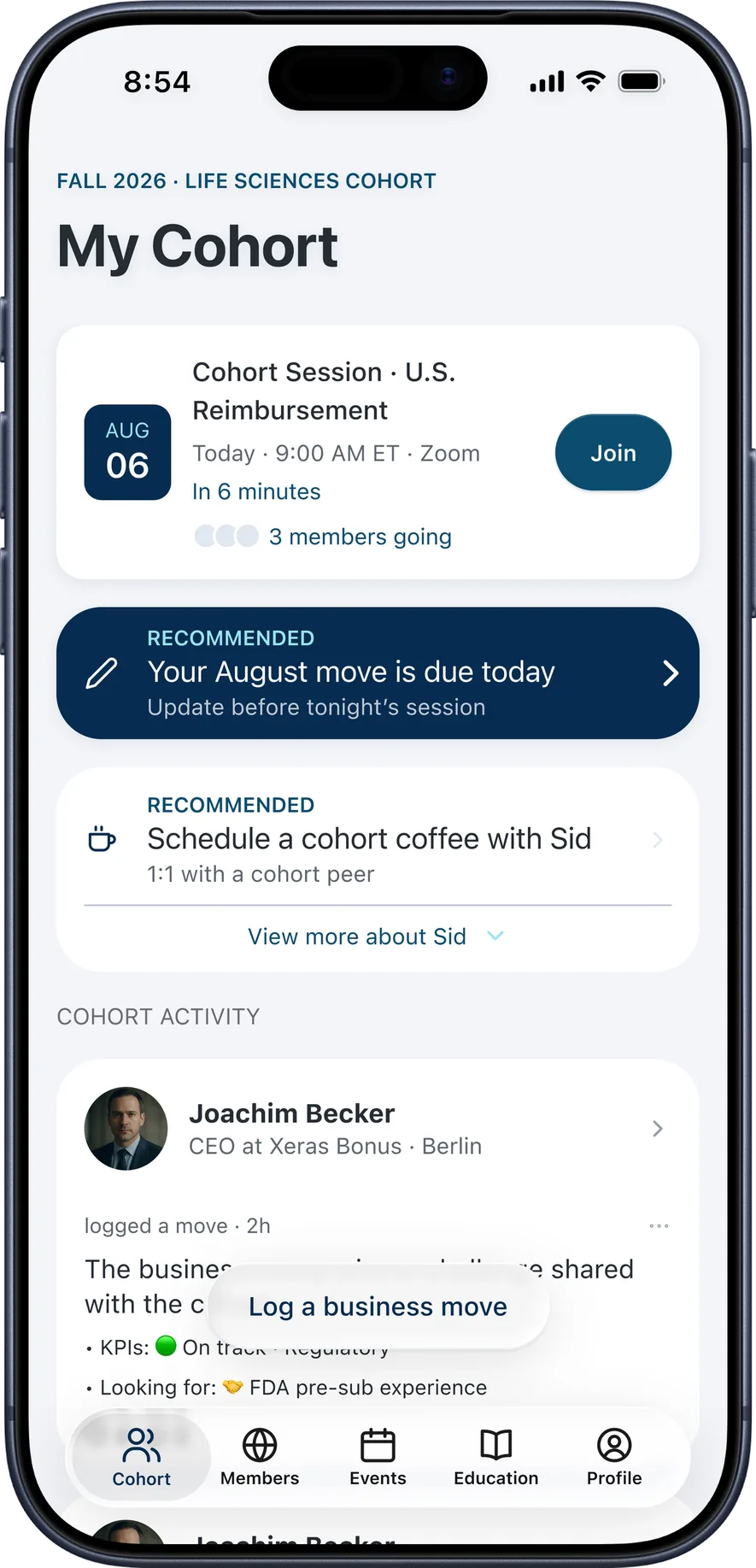
Before. A session to join, a move due today, and a coffee chat to schedule, each styled as the most important thing on the screen.
After. One recommended peer and one button. Events move below the fold.
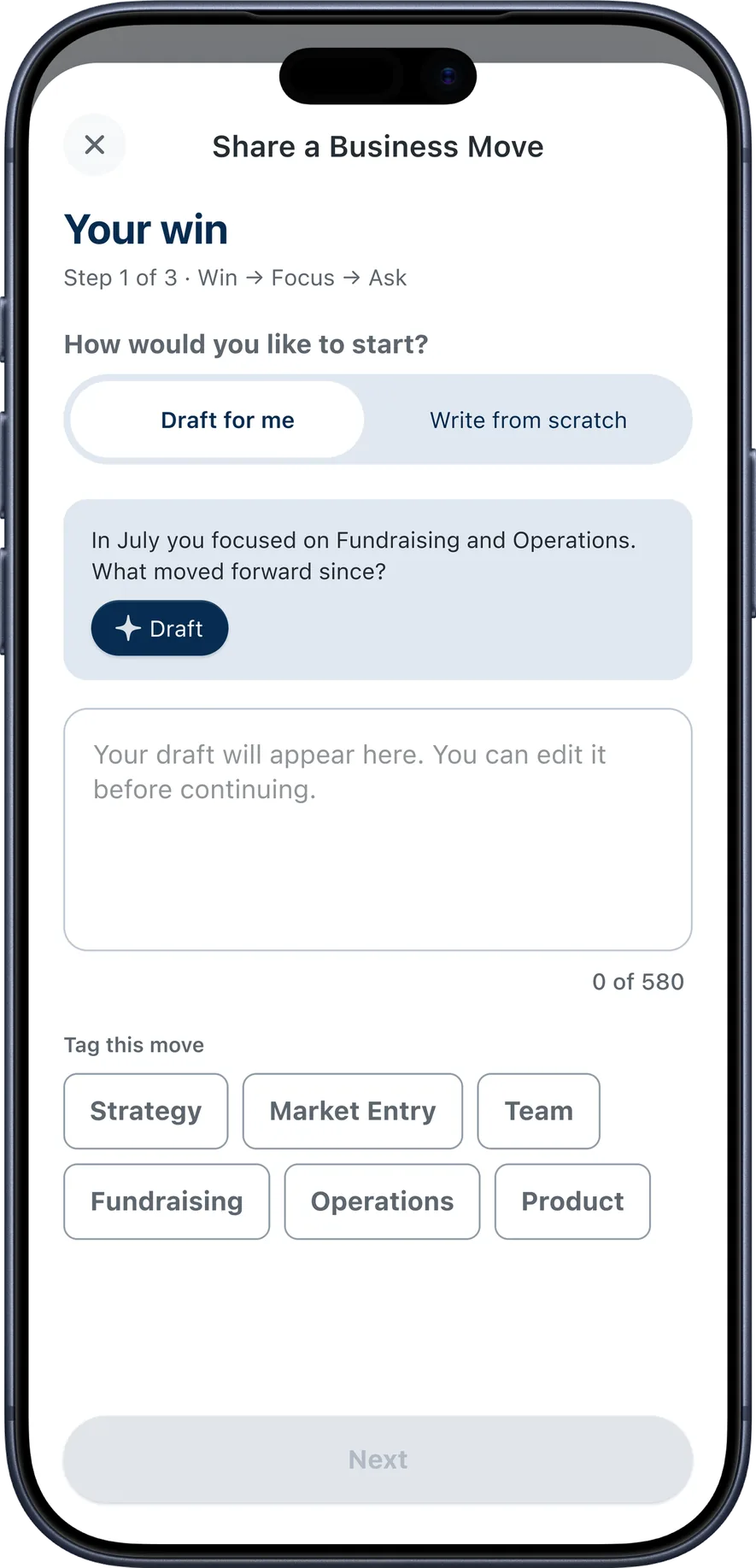
Before. The flow opened by asking a CEO to choose between drafting and writing from scratch, before they had written a word.
After. The month is in the title, and drafting is one optional button above an empty field rather than a choice to make before writing anything.
A design system CEO XB owns, and forty screens built from it
The 2025 build ran on GenSaas, an open-source library the product did not own, and 1,009 instances still pointed at it. I helped rebuild the system so CEO XB owns every token and component, and the forty final screens are built from it.
The system starts with eleven colors, nine text styles, and two shapes
The 2025 file called its colors Primary 700 and Neutral 300, so using one meant remembering which number was which. These are named semantically: the name is the job the color does. Type is SF Pro, because the product is built from Apple’s components.
- Brand/Midnight#062C50tint · active tab · actions
- Brand/Cerulean#0C4C6Fkickers · links
- Brand/Cyan 200#9AE4F1kicker line on navy
- Text/Primary#252C33titles · body
- iOS Label#6B6B73sections · subtitles
- Text/Muted#929DA8timestamps
- Border/Default#BEC8D3locked outlines
- Surface/White#FFFFFFcards · glass
- Surface/Tint#E0E8F1chips · cells
- Grouped BG#F2F4F8screen ground
- Surface/Disabled#F5F5F5locked
- The cohort is the productDisplay · Bold · 32
- The cohort is the productXL · Bold · 24
- The cohort is the productL · Semibold · 17
- The cohort is the productBody · Regular · 15
- The cohort is the productBody Emphasized · Bold · 15
- The cohort is the productSmall · Regular · 13
- The cohort is the productSmall Emphasized · Semibold · 13
- The cohort is the productXSmall · Regular · 12
- The cohort is the productXSmall Emphasized · Semibold · 12
- White on Midnight14.2:1 · passes WCAG AA
- White on Cerulean9.2:1 · passes WCAG AA
- Text Primary on white14.1:1 · passes WCAG AA
- iOS Label on white5.3:1 · passes WCAG AA
Color, type and shape become the controls a member taps
Three button families, plus the chips, rows and inputs a member fills in. Every family carries a when-to-use note, so another designer can pick one without asking.
Midnight is for committing: agreeing, saving, moving through a required flow. Cerulean is for inviting: lower-stakes actions that do not demand anything. The test: if a member tapped this by accident, would it matter? If yes, Midnight. If no, Cerulean.
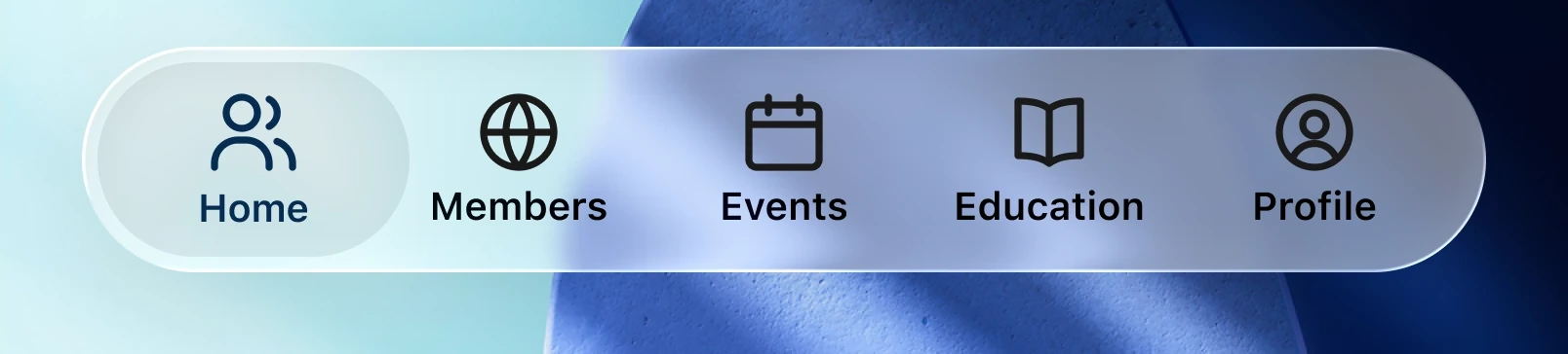 White at 45%, with a 0/8/40 shadow at 12%.
- 44 × 44WCAG minimum
- 48 × 48glass buttons
- 80 × 84tab bar item
- Chip — stage, funding, and topic labels40
- AI prompt — the drafting offer in the update flow6
- Text area — where a member writes their update6
- Segmented control — coffee chat or update, on home4
- KPI row — on track or at risk3
The controls build the cards and bars a member recognizes
A member never sees a color or a text style. They see the card that introduces a peer, and the bar that moves them around the app, which is where the move from course to cohort shows.
The bar is also where a scope decision shows. We had scoped the work to features and left the platform alone, then found in detailed design that new features kept landing on the old chrome. Moving the app to iOS 26 and its Liquid Glass materials was the cheaper fix: Apple supplies the bars, the blur, and the hit areas, so the whole app reads as one native product rather than new work bolted onto an older shell.
- Event card — date, place, and who from your cohort is going15
- Member card — a peer, their stage, and a way to reach them14
- Feed post — a member's move, numbers, and ask14
Two of the four parts that frame a screen came from Apple
The status bar and the tab bar are Apple’s, down to their hit areas, so a member already knows how they behave before opening the app. The header and the progress bar are the two that needed designing.
- Status bar — Apple’s, unchanged32
- Header — ours: the cohort line and the screen title4
- Progress bar — ours: how far into the update flow a member is13
- Tab bar — Apple’s 91px bar, on the home screens4
Key Screens
The audit: what I’d fix next
- 01Store every color once
The same navy is saved twice, once under its 2026 name and once under its 2025 one, with nothing connecting them. Link them and changing the brand color is one edit instead of forty.
- 02Keep one spacing scale, not two
Two sets of spacing sizes use the same names, so the gap called space-5 is 8 pixels on the home screen and 12 in the update flow. Keep one set and a gap means the same thing everywhere.
- 03Give each text style one weight
The style called Body Emphasized is medium weight on one screen and bold on another. Pick one, and give the other its own name.
- 04Reconnect the eight copies that drifted
Eight frames hold copies of components instead of the components themselves, so they stopped updating when the originals changed. Four are the Interested button on the home screens, and four are a coffee chat promo card.
- 05Name every component the same way
The event card is filed under three different names, one of them left over from a component that was retired. One naming pattern, used everywhere, makes components findable.
- 06Add the last ten components to the library
About ten components, the top navigation and the onboarding inputs among them, were built straight into screens while the app was being coded and never added to the shared library.
None of these are large changes, and together they turn a working library into a system another team could run without me.
How I used AI to prototype, build, and audit this product
Claude Code ran through every stage of this project, reading the design system out of Figma through MCP, a connection that lets an agent read a design file directly: six concept prototypes for research, the inherited system audited and rebuilt, the forty final screens, and the deployed app.
This is what the workflow produced, running in this page
The full journey, with the AI features running on the Anthropic API. Add it to your home screen on an iPhone and it behaves like a native app.
I shipped the six concepts as working software instead of mockups
Research needed six ideas in front of people. Each shipped as a working, deployed prototype rather than a clickable mockup, written from a structured prompt. The eleven-page runbook I wrote took a designer from a blank chat to a shareable URL in about ninety minutes.
- <role>who the model is being asked to be
- <brief>what to build, in one paragraph
- <constraints>the library to build from, and the look to rule out
- <deliverable>what comes back, and in what form
The scaffold lived in one markdown file that also carried the design language, the color tokens, the component patterns, and the anti-patterns. Starting a new concept meant rewriting the brief and leaving everything else in place, so every prototype inherited the same system knowledge. What made the output usable was the file, not the prompt.
Name the anti-patterns, because silence has a default.
The generic AI aesthetic is what you get when you rule nothing out: cream backgrounds, warm serifs, terracotta accents, stock card layouts. The runbook names all of them.
Show the model screenshots instead of describing the look.
The model matches what it sees far more reliably than what it reads, so a screenshot of the existing product beats a paragraph describing it.
Mark what you actually verified.
Every value in the design-system summary is labeled confirmed or approximate. An agent treats a guess and a fact identically unless the document says which is which.
The agent read the inherited design system, then built its replacement
Nobody knew how much of the 2025 file still depended on GenSaas, the outside library under it. Claude read the file through MCP and counted 1,009 instances pointing at a library the product did not own.
$ get_variable_defs
  "Brand/Midnight": "#062C50"
  "Brand/Cerulean": "#0C4C6F"
  "Text/Primary": "#252C33"
  "Type/Body": "SF Pro Regular 15/20"
  "Spacing/space-5": "8"
Once the tokens were extracted and owned, the agent read them back the same way and wrote the React and Tailwind the app runs on.
- Figma library
- MCP read
- Claude Code
- React on Vercel
- Screens back in Figma
Working with an agent introduced a problem the canvas never showed
A teammate noticed that the newest frames carried the right components and asked what had changed. Neither of us knew, so I had Claude read the file through MCP again and count real instances against plain frames on every page.
- Nav / Tab Bar
- Cohort / Feed Post
- Member / Card
- P - Bordered Prominent
- Nav / Tab Bar
- Cohort / Feed Post
- Member / Card
- P - Bordered Prominent
- Rounds one to three — our component names, none of them linked0
- Round four, Business Moves — every component placed from the library352
- The final 40 screens — two hand-built exceptions, the rest live269
Two components in the final forty were built by hand rather than placed from the library: the Interested button on the home screens, which is the four copies the audit above counts, and the calendar day cells, which the library has no component for.
The fix was one sentence in the prompt and a five-second check
An agent will not use the design system unless you tell it to, and it will not tell you when it didn’t. So the library goes in every prompt now, and every screen gets checked afterward.
Build these screens.
The agent invented layers and labeled them with names it had seen. Where it had no reference, it made a name up, which is why the versions drifted apart.
Build these screens from our design system library.
The agent searched the library and placed real instances. This is the version that ships.
- •
The layer name reads Category / Component, not div, Frame 1234, or a class string
- •
The right panel shows the component header and an option to go to the main component
- •
Fills show a variable name such as Brand/Midnight, not a raw hex value
Figma has a feature that does this automatically. Code Connect links a component in the codebase to its twin in the library, so an agent knows which is which without being told, but it needs an Organization plan we did not have.
What building real software taught me about design
Working this way moved the job from making to specifying and checking.
The agent produces the artifact. Whether it is any good comes down to how precisely I brief it and how carefully I check what comes back. Both of those are design work.
The deployed code is the source of truth.
When the code and the design file disagreed, the code won, and I updated the file to match. A handoff needs exactly one source of truth.
Build shared content once, as one component.
Three separate bugs came from the same cause: something that appeared on two screens was built twice, and the copies drifted apart.
An AI feature earns trust by showing its sources.
Participants assumed the AI read their real data and trusted it less when it clearly hadn’t. So I gave it their real history, an editor’s role rather than a ghostwriter’s, and a line on every draft naming the month it drew from.
What I’d do differently
Recruit the actual audience sooner.
We tested with professional proxies, not European life-sciences CEOs. The navigation and affordance findings transfer. The premise findings don’t, and I’d trade two weeks of polish for more sessions with real CEOs.
Test whether a posted update actually leads to a coffee chat.
That is the bet the whole product rests on. We built both halves and tested each one separately, but the step between them, reading a peer’s update and booking time with them, never faced a participant.
Turn on analytics before launch, not after.
A deployed product can watch how people actually use it, and ours mostly didn’t. Without that, what gets built next comes from what people say in a session rather than from what they do.
Check the layer panel from the first build, not the fourth.
Three rounds of screens carried our component names and none of the links. The check that catches it takes five seconds per screen, and I did not start running it until round four.